Causal Diagrams
Read this tutorial, which illustrates two ways of diagramming cause and effect. They allow for the description of multiple causes and effects from a single event and for distinguishing between levels of causation.
When multiple relations of cause and effect are involved in the behavior of some phenomenon, representing these relations visually is often the best way to get a handle on them and to assist in quantitative analysis of the system in question.
The world being a complicated place, events are often related by complex causal connections. Cause and effect diagrams can play an important role in understanding such connections, and assist in the calculation of statistical and probabilistic dependencies. By laying out these connections, diagrams can help us identify important crucial factors in the explanation, prediction and control of events. Here we briefly discuss two popular types of cause and effect diagrams.
§1. Causal Networks
Causal networks are diagrams that indicate causal connections using arrows. Here is a simple example where an arrow from A to B indicates that A is the cause of B.
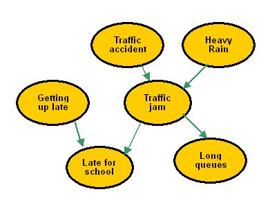
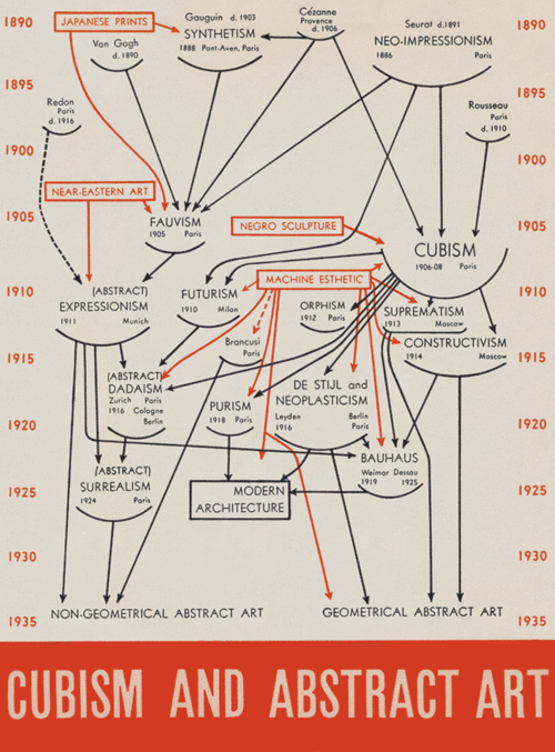
Causal networks are particularly useful in showing causal processes which involve a number of different stages. Here is a beautiful diagram created by Alfred Barr, the first director of the MOMA museum, showing the influences between movements in modern art:
In science, the arrows in a cause and effect diagram can be given probability assignments to indicate how likely it is that one event would lead to another. Special algorithms or programs can then be used to calculate how likely it is for a particular
effect to come about. These networks with probability are known as "Bayesian networks" or Belief nets".
§2. Fishbone Diagrams
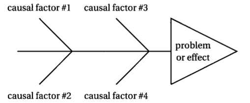
Fishbone diagrams are so-called because they resemble fishbones. They are also called "Ishikawa diagrams", named after Kaoru Ishikawa of Japan. A fishbone diagram is a graphical representation of the different factors that contribute to an effect. They are often used in business and management.
In a typical fishbone diagram, the effect is usually a problem to be resolved, and is placed at the "fish head". The causes of the effect are then laid out along the "bones", and classified into different types along the branches. Further causes can be laid out alongside further side branches. So the general structure of a fishbone diagram is something like this:
Here is an example of how a fishbone diagram can be used to display different types of causes:
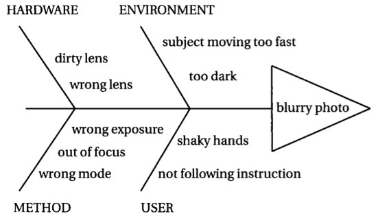
One advantage of these diagrams is that they give a big picture of the main causal factors leading to the effect. These diagrams are now often used in quality management, and in brainstorming sessions.
Source: Joe Lau and Jonathan Chan, https://philosophy.hku.hk/think/sci/cause-diagram.php This work is licensed under a Creative Commons Attribution-NonCommercial-ShareAlike 4.0 License.